Wikipedia Android: Quality and Evolution
This essay describes how quality is defined for the Wikipedia Android app and how quality control is applied throughout the development process. The evolution of quality through time is also discussed.
System key quality attributes
The system’s key quality attributes have been discussed in detail in the previous essay1 and so they will only be summarized here, so that more focus can be put on Accessibility, the attribute found to need more work.
Modularity: the developers made good use of the project’s language, Kotlin, which encourages the use of modules and very clearly applied them to break down the system into useful components.Compatibility: the latest version of the app is able to cover the devices of 95.28% of the users, according to Statista2, and warnings are sent in advance when an older version of the app is no longer going to be supported.Maintainability: most of this attribute is achieved due to the development culture for the project. Any user is able to take part in the development loop, be it by creating issues for problems found, by asking for new features or to take on existing issues and develop them into the app. The biggest downside of the app’s maintainability lies in the scope of documentation. Much of the code has insufficient comments for a new developer to quickly grasp the logic. Also the issue overview can be overwhelming at first since their organization is not elementary.Accessibility: Some high level improvements were discussed, and they are further discussed in more detail below:
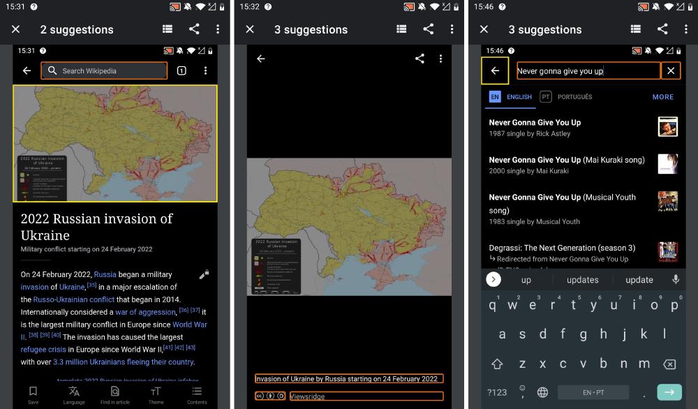
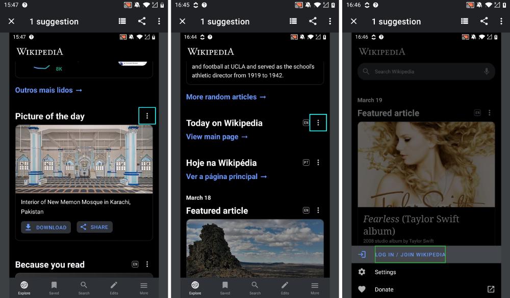
In order to assess the accessibility of the Wikipedia app the Accessibility Scanner3 app was used. This allowed us to gather objective metrics on accessibility and visualize what improvements are possible. Some of these possible improvements are shown in the Figure below.
- Lack of label for an item (highlighted in
yellow): the label is necessary so that clickable items can be understood by screen readers even if the item does not contain a visible text (such as icons with just an image) - Touch target too small (highlighted in
orange): Clickable items are expected to have a minimum size to be comfortably accessed even by people with motor disabilities - Repeated item descriptions (highlighted in
cyan): some icons contain the same label to describe it. Even though it may do similar things, it is important for a person who depends on a screen reader to be able to choose what to click. - Low text contrast (highlighted in
green): the colors between the text and the background should have enough contrast so that anyone is able to read it, including those with any type of visual impairment


Figure: Accessibility warnings overview
When comparing with older versions of the app, it is possible to see that even though some accessibility improvements can be made, it has been on the developer’s radar4. Many more of the above mentioned problems were found, with the most notable being the low text contrast even on the search bar, one of the most important clickable items in the app.
Quality culture
In order to get a better understanding of the quality culture among the developers of the project, the workflow of 13 pull requests and their corresponding issues (if applicable) was analyzed. These can be found in Table 1 below.
| PR | Description | corresponding issue |
|---|---|---|
| 39 | create “my contributions” page | T207339 |
| 65 | Design review (several UI changes) | T214504 |
| 169 | Migrate to AndroidX | - |
| 255 | Open articles in current tab | T222056 |
| 412 | Update edit description flow | T225635#5281259 |
| 507 | Sunset ‘nearby’ functionality | T228661 |
| 576 | Optimize page loading | - |
| 992 | Add a feed card for image tags | T244866 |
| 1146 | Enable matching system light/dark mode | T250160 |
| 1185 | Add Contributions details screen | T250191 |
| 1268 | Resurrect the main page | T253397 |
| 2637 | Add In-article notifications | T287113, T285765, T288248 |
| 2898 | Design tweak to Search & Filter | T288068#7425074 |
Table 1: List of Pull Requests and corresponding issues that were analysed.
The first thing that stands out is that the pull requests on Github are relatively barebones.
It usually contains just a name and brief description, where the description either explains the reason for the pull request or only contains a link to the relevant issue.
That is because most of the communication about code changes happens on their own issue tracker board called Phabricator.
On this site, the issues are discussed in a structured manner, often starting with a reason why the change is necessary before diving into the details of the (desired) implementation.
New features or modifications to existing features are explained by describing its desired flow and UI design changes are proposed by adding a prototype sketch in Figma, for example.
The relevant labels are added to the issue and it is added to the triage stage.
One of the core project developers then assigns it some point value relative to the costs of resolving the issue and moves it to the correct section on their issue board.
Then, any developer can claim the task.
However for most architecturally important issues/PR’s reviewed here, usually a core developer on the person that triaged the issue claims the task is also a part of the core team.
After that, during the development of the new task, there is still a lot of discussion going on about the issue.
From these discussions, it is clear that the other developers (who did not claim the task) are still checking in on the progress and are giving feedback about the direction the solution is going in (or should be going in).
This peer reviewing is also clear from the aforementioned sparse PR’s on the GitHub side.
Here, code changes are also inspected by other developers and pretty specific issues are pointed out and addressed.
Once a developer is done with the implementation, the issue is assigned to a relevant signoff (e.g. design signoff for a design change), and finally, it is reviewed by a member of the QA team.
Once they give the green light (often by commenting “Looks good to me”, combined with the build they tested it on), the issue is ready to be resolved by merging the corresponding pull request.
Integration and deployment

Figure: GitHub Actions and Gradle are used for Continuous Integration and Deployment of the Wikipedia Android app. (GitHub Actions logo and Gradle logo are property of their respective brand owners)
The main development team has configured extensive Continuous Integration and Deployment on the project repository. The Gradle build tool takes care of running the test suite, running linting software, building the project and preparing it for deployment. It integrates nicely with Android Studio and allows running a lot of different build steps individually or collectively. On the repository GitHub Actions online CI/CD pipelines are set up to automatically run required build steps, helping the main developers quickly assess Pull Requests and overall code health. Using Gradle is required when building an Android app, so this can hardly be considered a design decision. However, we have noticed how Gradle runs generally take a long time (around 10 minutes) both locally as well as with GitHub Actions. This has the potential to slow down development of the project.
Test suite
Although for most of the new issues being tackled, it is asked to provide unit tests together with the feature, it is possible to see that the test coverage is not great. Almost all of the tests present are unit tests, which do not cover most modules (only 17 out of the 51 are covered). Some system/integration tests are present for specific activities, such as account creation. It was not possible to get precise numbers on coverage because even though the tests could be run and passed in a regular fashion, running them with coverage led them to fail. That was found to be a common problem for kotlin projects on android studio, and adding extra plugins (such as JaCoCo5) to calculate it did not improve the scenario.
Hotspots
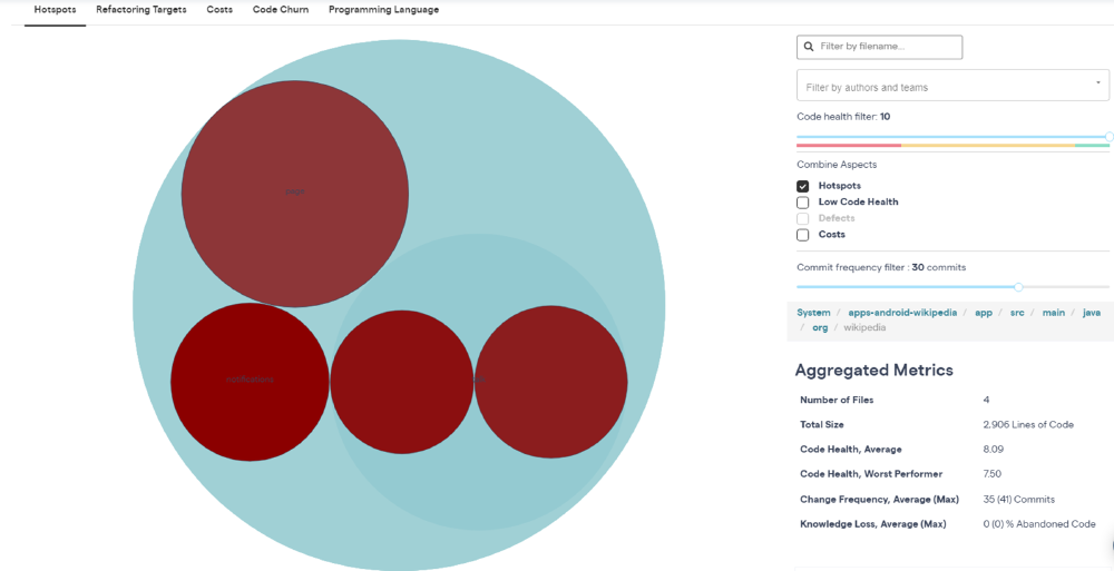
The Wikipedia Android application has been under development for over seven years. In this time, around 3100 pull requests were merged. In this section, a tool called Codescene6 was run on a fork of the project and used to identify parts of the code that, over those 3100 pull requests, have changed faster than other parts.

Figure: Hotspot files, as identified by Codescene.
The analysis results point to a few hotspot files, that can be seen in the Figure above. These files have an average of more than 30 commits per year and a code health score between 7.5 and 8. This is slightly below the rule of thumb to have a score of 8 or 9 that Codescene gives for projects like the Wikipedia Android app7. Out of these 4 files, Codescene gives a ‘danger notification’ about the TalkTopicsActivity.kt file, warning that there is a decline in health in this hotspot file that will be expensive to reverse if not acted upon early.
Inspecting the file manually shows that although this relatively big file (approx. 500 lines) is readable, it contains almost no documentation.
Not a single function in this folder is preceded by comments describing the functionality.
Furthermore, there are only two lines of comments in total, that give a brief justification for a small part of a function.
With regards to documentation, the TalkTopicsActivity.kt file is not an outlier.
The aforementioned style of (lack of) documentation can be found in almost all the files in the repository.
As mentioned in the Product Roadmap in Essay 18, the application is currently in a relatively stable state, with the current development focussing mostly on improvements of existing features and showing more statistics to the user. This task will span across many of the existing components and therefore we would argue that there will be fewer hotspots in the future, as the current hotspots become modified less often and hopefully few new hotspots will be created.
Technical debt
The developers have a label for issues just related to technical debt. The great majority of open tasks with this label for this are considered low priority and are related to refactoring multiple classes to use ViewModel, with the purpose of improving user experience by keeping necessary information from their respective activities even when certain events happen, such as the user rotating the phone.
Some other issues involve their testing procedure, with higher priority. Examples of those are creating a set of tests for simulating version upgrades and improving the smoke tests.
The small number of issues and low priority of them suggest low overall technical debt.
This is confirmed when exploring the project with SonarQube9, the result of which can be seen in the Figure below.
It rated its technical debt level with an A, a result of a 0.1% ratio.
In raw values, it totals to 8 days and 4 hours of work, most of it involving the use of deprecated code and methods that are kept empty, many of those with TODO comments about implementing them.

Figure: SonarQube output for the project
This essay gives an insight into the software quality of the Wikipedia Android app. We have seen how the development team ensures certain standards by means of having a consistent culture and tools usage. We also covered the key quality attributes in more detail, focussing on accessibility. Finally, with the help of external tools, we did further analysis on aspects such as hotspots and technical debt.
-
Group 65. Wikipedia Android: From Vision to Architecture. https://desosa2022.netlify.app/projects/wikipedia-android/posts/architectural-decisions/ ↩︎
-
Statista Research Department. Mobile Android operating system market share by version worldwide from January 2018 to December 2021. 17 March 2022, https://www-statista-com.tudelft.idm.oclc.org/statistics/921152/mobile-android-version-share-worldwide/ ↩︎
-
Google LLC. Accessibility Scanner. Available at https://play.google.com/store/apps/details?id=com.google.android.apps.accessibility.auditor ↩︎
-
Cooltey Feng. Accessibility support in the Wikipedia Android app. 21 January 2022, https://diff.wikimedia.org/2022/01/21/accessibility-support-in-the-wikipedia-android-app/ ↩︎
-
Jacoco. https://www.jacoco.org/jacoco/ ↩︎
-
Codescene. https://codescene.com/ ↩︎
-
Adam Tornhill. Measure the Code Health of your Codebase: a continuous feedback loop for engineering decisions based on data. 22 September 2020, https://codescene.com/blog/measure-code-health-of-your-codebase#whats-a-good-code-health-score ↩︎
-
Group 65. Product roadmap. https://desosa2022.netlify.app/projects/wikipedia-android/posts/product-vision/#product-roadmap ↩︎
-
SonarQube. https://www.sonarqube.org/ ↩︎