If you are anything like us, you will have come across the urge to be able to focus on developing your UI components by building and testing them in an isolated environment. This is exactly what Storybook1 allows us to do!
In this essay, we will describe what Storybook aims to do and the vision that they have laid out. In addition, we will present a short product analysis of Storybook. We will further discuss the mission and domain of Storybook and then further zoom in on the capabilities and qualities of the open-source tool. Finally, we will look at the stakeholders of Storybook, and we will end off with a glance into the bright future of Storybook.
Without further ado, let us take a look at Storybook!
 Figure 1: The Storybook user interface
The mission
Storybook is a node package, mainly written in Typescript and React, that can help you build and develop components for your web project. See Figure 1 for an impression of how Storybook could look in your project. Storybook’s mission could be summarized as follows:
“Build component-driven UIs faster”
Storybook aims to make the process of creating UI components easier and faster. The package will try to make reusing the components simpler and more intuitive. In the sections discussing the capabilities & use cases and key qualities, we will further dive into how Storybook tries to achieve this and how it can be applied to various web frameworks.
Domain concepts
Storybook is mainly written in Typescript2 which perfectly aligns with the distribution of the open-source project by yarn3 and the node package manager4 (npm). These package managers are widely used in the type of projects Storybook tries to target. Frameworks such as Angular and React are compatible with these package managers, which allows the developer to easily add Storybook to their project.
As mentioned, the Storybook package is mainly written in Typescript2. This programming language further extends on JavaScript and provides a syntax for types. Type inference provides the developer with great tooling without needing any additional code. TypeScript is easily compiled to JavaScript which allows for the integration to build a node package.
Building, testing, and the CI/CD of Storybook are mainly done using the earlier mentioned package manager yarn. When contributing to the open-source tool it is also necessary to use these commands to validate and test your contributions.
Storybook’s functionality is thus provided by a single package that you can add to a project. However, Storybook also provides so-called “add-ons”, which are further extensions on the basic Storybook package. These add-ons often provide custom-specific functionality. For example, google-analytics5 is an add-on that provides the developer with functionality to incorporate Google Analytics6 logs/events/actions in their UI components. This add-on is a separate node package that is stored in the common @storybook directory. Common design pattern?
Capabilities and use cases
Storybook simplifies the workflow of developing UI components in isolation. By creating stories you can develop the entire UI without a database or the need for complex development stacks7. These stories encapsulate the rendered states of UI components. All important states and actions have to be written inside the story to describe how the component is rendered and can easily be customized with new data, styling, or actions.
All stories together form the library which is called the ‘Storybook’. This library is a showcase of all components of the website/application. The library has multiple benefits for both small and large companies:
- One place with all components that can be tested in isolation.
- Improves the reusability of components.
- It makes it easier for UI/UX designers (with less programming experience) to test the components.
Storybooks can already be used in conjunction with the following technologies and frameworks (note that there might be more available as of reading):
- React
- Vue
- Angular
- Web Components
- Ember
- HTML
- Svelte
- Preact
Key qualities
Key qualities focussed on users
Simplify workflow
The main advantage of using Storybook is that it simplifies the web development workflow. The web workflow of UI components consists of five main stages.
Build → Review → Test → Document → Distribute
Storybook has tooling for every state which makes the development workflow nearly seamless:
| State | Storybook features |
|---|---|
| Build | Allows for building UI components in isolation. |
| Review | Feedback of designers and stakeholders |
| Test | Visual and unit testing |
| Document | Structured auto-generated docs |
| Distribute | Component versioning |
Reusability
The second main benefit of Storybook is reusability.
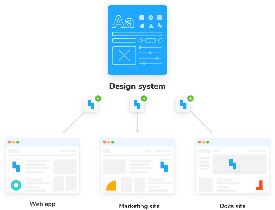 Figure 2: Resuability of design system components8
Large companies often have many different applications. For example multiple web/mobile apps, internal tooling, and prototypes. It takes a lot of time to create and design UI components. Every new application can be developed faster by reusing the already existing components. Most websites use mostly the same building blocks like buttons, text, icons, images, containers, navigation bar, and search bars.
Storybooks reusability has multiple benefits:
- Every application uses the same brand design
- No time wasted recreating (almost) the same components
- Flexibility in changing the design
- Testing and maintaining way fewer components
Key qualities of system
Performance
Storybook is used by many large companies, that often have more than 100 components. Al these components also have different actions and states, that are all customizable. To create a simple and fluent design workflow, the Storybook app has to be very performant.
Extensibility
It feels like every week a new JS framework is released. Storybook works tightly together with multiple web frameworks. Because there are so many JS frameworks, Storybook has to be easy extensibile to work with these new frameworks.
System Context
 Figure 3: Storybook context for UI developers
Eventually, the users of a system, such as that of Airbnb are the ones that will interact with the components built using Storybook. However, Storybook has no direct relation to those users. As displayed in Figure 3, Storybook builds and indexes the components built by the UI developers of a software team. These components can then be used by other developers within the same team or can be checked by stakeholders through the easy-to-use interface of Storybook.
Storybook in Practice
To illustrate, an example will be given on how Storybook is currently used in practice. Let’s say there is a large Dutch webshop, we will call it Thin.com. The Thin team is very large, therefore communication is important. Within Thin, you have a team called Design System, whose sole purpose is the creation of the components used in the website. They maintain these components and make sure that the usage throughout the website is consistent and follows the company’s standards.
Then there is another team called Product Pages, which is responsible for, as the name says it, the creation of each product page. They will build the front-end using the components built by the Design System team. To easily use these components, the Design System team can add documentation and interaction to the list of components by using Storybook. In this way, the Product Pages team does not have to ask the Design System team each time they use a new component, and no miscommunications will occur.
Furthermore, the stakeholders within the company, such as the customer journey specialists of Thin, can easily interact with the components and check whether this is the desired implementation of the components.
Finally, there are the consumers of Thin, who interact with the website and prefer a consistent user experience throughout their customer journey.
Technical System Context
With regards to the technical system context of Storybook, Storybook integrates with a lot of other frameworks. As mentioned before, frameworks such as React, Vue, Angular, etc. are to be considered during the development of a system that uses Storybook. Moreover, many testing tools such as Jest, Puppeteer, Selenium can be used in conjunction with Storybook.
Stakeholders
Storybook has multiple stakeholders, thousands of teams use Storybook to assist in building production UIs. More than 30 000 public repositories used Storybook by 2019, not to mention the large number of private repositories that also use it. Besides those teams, there is also the team of maintainers of Storybook who are important stakeholders.
Some examples of teams relying on Storybook:
- “UI engineers at Airbnb, Algolia, and Atlassian create the web’s most dependable UI components with Storybook” 9.
- “Frontend infrastructure developers at Formidable, Auth0, Artsy and JetBrains create comprehensive component libraries using Storybook” 9.
- “Engineering teams at GitHub, Adobe, and UK Home Office rely on Storybook to build and distribute UI components that impact millions of people” 9.
Storybook is maintained by hundreds of contributors worldwide and guided by a steering committee. There were more than 1400 contributors in 2021. Furthermore, Storybook is maintained by chromatic, which is a company that has been started by the Storybook core maintainers. And lastly, Storybook has quite some sponsors. In 2019, they received around 25.000 dollars from companies such as Airbnb, Applitools, Facebook, Chromatic, and Xebia.
The Road Ahead
In 2021, Storybook focused on a major overhaul to the architecture of Storybook’s core with an aim of improved performance and stability10. This has led to some major improvements such as:
- 6.4’s On-Demand Architecture: 3x smaller & 4x faster loads for static builds
- 6.3’s Vite builder: 10-100x faster startup times
- 6.2’s Webpack 5 support: leveraging the latest optimizations
- 6.1’s App UI caching: faster build times
With these optimizations and improvements in the performance realm under the belt. Storybook has set its eyes on refining existing features and improvements under the hood. Some key aspects of the plan for 2022 include:
- Speed: Webpack 5 build optimizations
- Weight: Modern ESM browser target to slim and simplify distribution
- Dependency conflicts: Pre-bundle dependencies to reduce install size and conflicts
- Reliability: Define a tight boundary around Storybook’s core and test more rigorously
In 2022, Storybook will also return its focus to one of its core use cases, UI Testing. Currently, when writing a story, users also unlock an ecosystem of test integrations that validate UI appearance, accessibility, and performance all in the same place as where the product is being used: the web. This is one of Storybook’s biggest strengths and in 2022 this will be given even more attention with improvements of interactive stories and interaction testing which were shipped at the end of 202111. Furthermore, new features will be added to make the testing experience even more seamless:
- A Playwright-based test runner that can execute your stories in parallel and provide links to test failures for interactive debugging in the browser.
- Revamped addons for accessibility and performance.
- Improve story reuse across all frameworks and tools.
The future of Storybook is looking very promising and it is good to see that the growth and innovation of Storybook are not slowing down anytime soon!
References
-
Storybook: https://storybook.js.org/ ↩︎
-
TypeScript: JavaScript With Syntax For Types.: https://www.typescriptlang.org ↩︎
-
Yarn - Package Manager: https://yarnpkg.com ↩︎
-
NPM: Node Package Manager: https://www.npmjs.com ↩︎
-
Storybook Addon Google Analytics: https://github.com/storybookjs/addon-google-analytics ↩︎
-
Google Analytics: https://analytics.google.com/analytics/web/ ↩︎
-
Storybook introduction: https://storybook.js.org/docs/react/get-started/introduction ↩︎
-
Storybook design system https://storybook.js.org/tutorials/design-systems-for-developers/react/en/architecture/ ↩︎
-
Storybook use-cases: https://storybook.js.org/use-cases/ ↩︎
-
State of Storybook: https://storybook.js.org/blog/state-of-storybook-2021/ ↩︎
-
Storybook 6.4 release: https://storybook.js.org/blog/storybook-6-4/ ↩︎