In our second essay about Storybook, we will focus on the way Storybook works under the hood, and how the large software project is structured to ensure maintainability, testing, and performance.
We will take a look at some overarching motifs, and then we will keep zooming in onto the different views (Container, Component, etc.) that are specified in the C4 model1. Finally, we will look at how this all relates to Storybook achieving their key quality attributes as outlined in our first essay2.
The main architectural style of Storybook
The Storybook application reaches over multiple different domains, spanning front-end, back-end, bundling and building all into one package.
All of the code for these components is maintained in a single repository, a so called monorepo configuration3.
Because of the large size of and great variety in the monorepo, we have been unable to find a consistent overarching architectural style for the development of Storybook. Therefore we will instead go into some design patterns that are used for specific parts of the application.
To start off, the front-end user interface (UI) of Storybook, also called the Manager UI, which surrounds the component preview, is written in React with the use of plain React Context4 & React Hooks5 for state management, sharing and use within the component tree. The actual component preview itself is built using the project-specific target framework.
To handle communication between the different components in the system, e.g. the Manager and Preview, the systems make use of the event-bus design pattern6. This works by publishing all events, such as forcing a rerender, to the event bus. Different components can then subscribe to this bus and handle the events independently and asynchronously. This allows for better scalability as it decouples the containers from each other. We can see a diagram of the interactions within the event-bus pattern in Figure 1.
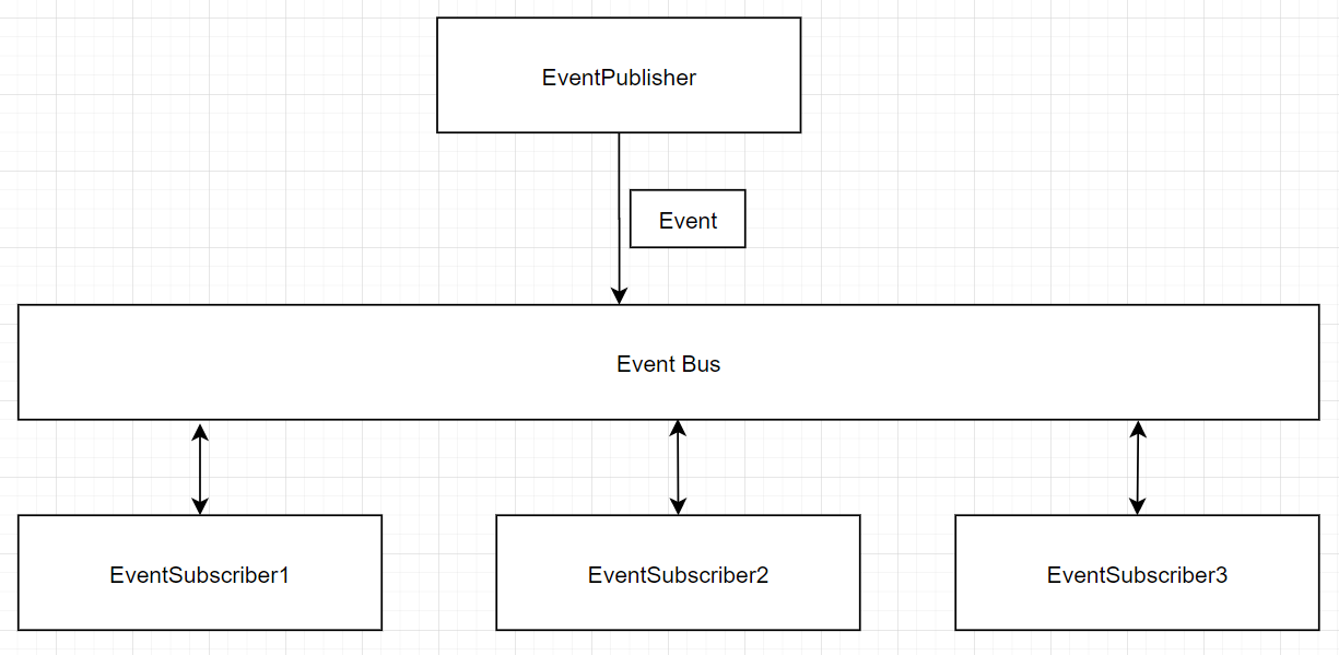 Figure 1 Event bus architectural pattern
Container View
When we take a look at the container view of Storybook, we’ll notice that Storybook effectively runs in 3 places.
- Node, which serves the local web app
- The “preview” IFrame, which builds and renders the user’s components
- Manager UI & API, which surrounds the preview with the storybook + addon UI, and allows for the interactive features of Storybook.
An overview of these different containers and their interactions can be seen in Figure 2.
However, an important extra container that should be mentioned, is the Event Channel. This container manages the flow of communication of events between the Preview, Manager & API. This container is the implementation of the Event-Bus design pattern as can be seen in Figure 1.
Because Storybook supports several different Javascript front-end frameworks (e.g. React, Angular, Vue, etc.), the preview renderer and the corresponding builder differ depending on the type of project the user is working on.
Lastly, Storybook also has a CLI application, which makes integrating Storybook into (existing) projects easier for users. This CLI application is a standalone container, only used for project set-up, and has therefore been excluded from Figure 2.

Figure 2 Storybook container view (excluding the CLI)
Components View
The Storybook repository contains over 122 000 lines of code! How is such a large project maintainable? Storybook is divided into many smaller components, which will be discussed in this section. Whereas a lot of large projects are divided into multiple repositories for each component, Storybook uses Lerna 7 to manage it as a mono repository. This means that the various components all reside within the same repository. The repository is written in TypeScript and uses Webpack to create Javascript bundles for rendering the stories 8. Have a look at our previous post 2 to see what stories are. The following components are the most important components within the repository:
- ui: A React based UI which you can initialize with a function 9. It is based on the Mantra architecture 10.
- addons: A node module used to load custom addons to storybook.
- core: A proxy package implemented by the core-client and core-server components11.
- core-server: Contains common node-side functionality used among the different frameworks. It contains: dev server, static builder, presets handling12.
- core-client: Contains browser-side functionality shared amongst the frameworks13.
- store: Responsible for loading a story from a CSF file and preparing into a Story type.
- cli: Command Line Interface implementations.
- docs: Documentation for StoryBook users.
- api: Communication between external application and Storybook core.
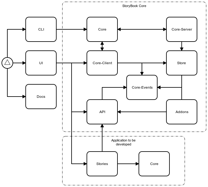 Figure 3 Storybook component view
These components are also displayed in Figure 3, which shows the relations between each of the components. The circle on the left is the user of the system. He or she can either interact with the CLI, the UI or the Docs. When using the UI, Storybook will be linked to their own project with the use of the API component.
 Figure 4 All of Storybook’s components
The entirety of the relations between all the components of Storybook are displayed in Figure 4. This figure shows the complexity of the project. There are many cyclic dependencies between the components and there seems to be a lack of the usage of an architectural style. This is something that can be improved upon! Another way to look at such a system is by means of a connectors view. However, since the project does not use any external databases and/or connections, a connectors view does not seem suitable for an investigation of the system. Therefore, we will skip right to the development view!
Development View
Storybook tries to reduce the amount of dependencies. However, the project still has 148 main dependencies of which 6 are of other Storybook projects. Most of these modules have many sub-dependencies, which requires a total of 3102 dependencies to run Storybook. Not all of them are equivalently important, so only the most relevant will be explained.
| Framework | Description | Used to |
|---|---|---|
| Babel | JavaScript compiler that converts your code to a backward-compatible version of JavaScript in most browsers and environments | Make all JavaScript code backward compatible |
| Http-server | Simple static HTTP server that is powerful enough for production usage and easily customizable | Serve the Storybook website for development |
| Jest | JavaScript testing framework | Write unit and UI tests |
| Lodash | JavaScript utility library with many easy to use and performing methods | Speep up development and gives cleaner code |
| React | JavaScript web framework for building complex component-based UI’s | Develop the front-end |
| Rollup | Module bundler for JavaScript, which allows to use the new module system of ES6 with older formats | Use the new module system with formats that don’t support it yet |
| Typescript | Strongly typed programming language that builds on JavaScript | Develop most of the project |
| Webpack | Module system and asset bundler | Bundle modules and assets |
Storybook also needs the dependencies of all web frameworks it supports. For example, to make Storybook work with Vue it also needs all the dependencies of Vue. Every supported framework needs around 25 additional dependencies. Those are only needed if you use that particular framework.
Development View of Stories
Another important part of the development process of Storybook is the way stories function and how they interact with the functionality of Storybook itself. These stories are written by users of the application in the Component Story Format (CSF), which is an expressive, platform-agnostic format. Under the hood, CSF is standard JavaScript that’s decoupled from Storybook’s API14. This keeps every story separated and makes it easier to interact with. By keeping the format of writing stories separated from the Storybook API itself, no duplication is required for the different platforms that Storybook supports, while also allowing CSF 3.0 to be used outside of Storybook altogether. Component Story Format allows for standardization which unlocks the ability to test components with Jest, import them in Sketch designs, paste them into InVision prototypes, and visually test them in Chromatic with only a single format15.
Runtime View
The most important scenario of Storybook is customizing and testing components in the UI. To make this happen the UI needs to interact with the core-client, API, and stories as explained in the Component View section. The core-client is used for all browser-side functionalities. The API is used for the communication between the application, events, and UI. The stories are needed to load the developed UI components.
Architecture & Key Qualities
As mentioned in our previous essay2, Storybook aims for a couple of key qualities which are of paramount importance to this system and the functionalities it provides to its users. Of course, the ease of use and simple workflow that can be achieved while using Storybook is one of those. This is achieved by the architecture being modular and split up in several usable components. For example, the separations of different interfaces the developer can use (graphic UI and the discussed CLI), enable a simple workflow. The developer is in charge how the system is configured to allow a personal simplest workflow.
Furthermore, the reusability is also due to this modular setup and separation between different web frameworks Storybook is able to work with. The add-ons architecture also allows the developer to easily add and remove extensions to his project, instead of having to build workarounds/extensions all by yourself. The way UI components are built using the same layout and syntax by Storybook allows for easy reusability. This also allows you to easily reuse the same component in a different web platform!
Performance is another key quality that is achieved by only initially providing a ‘core’ version of Storybook. Reusability and performance could be a trade-off as having the entire (reusable) Storybook package initially (with all add-ons) would affect the performance. By giving you the option to configure your Storybook use yourself, you can optimize this balance to your need!
Extensibility is also achieved by the add-ons architecture structure. Developers can build and share their own extensions easily by having this structure in place. As you can see, all key qualities come together as this also further stimulates the reusability!
API Design Principles
The Storybook system is very modular, which provides already one big checkmark for API design principles. However, we found that Storybook also does a really good job when it comes to other API design principles. The naming in Storybook is pretty strict which provides the devloper with meaningful names and consistency.
The overall architecture complies with the architecture standard of a Node module (which of course it not only a choice but pretty much necessary). The way Storybook structures the architecture of the add-ons is also compliant with the standard for node modules with additional plugins. Furthermore, we have found error messages in the graphic UI and the CLI helpful and self-explanatory.
-
https://desosa2022.netlify.app/projects/storybook/posts/storybook-product-vision/ ↩︎
-
https://github.com/storybookjs/storybook “Storybook Monorepo” ↩︎
-
https://reactjs.org/docs/context.html “React Context” ↩︎
-
https://reactjs.org/docs/hooks-intro.html “React Hooks” ↩︎
-
https://ducmanhphan.github.io/2020-06-06-Event-Bus-pattern/ “Event Bus pattern” ↩︎
-
https://storybook.js.org/blog/storybook-on-demand-architecture/ ↩︎
-
https://github.com/storybookjs/storybook/tree/next/lib/ui ↩︎
-
https://github.com/storybookjs/storybook/tree/next/lib/core ↩︎
-
https://github.com/storybookjs/storybook/tree/next/lib/core-server ↩︎
-
https://github.com/storybookjs/storybook/tree/next/lib/core-client ↩︎
-
https://storybook.js.org/docs/react/api/csf “Component Story Format” ↩︎